What is Contrast: Everything You Need to Know
Contrast is the art of highlighting differences to create clarity, emphasis, and visual interest. But what is contrast exactly? Whether you’re a designer working on a stunning graphic, a writer aiming for powerful storytelling, or simply someone who appreciates the finer details of everyday life, understanding contrast is essential. In this comprehensive guide, we’ll explore the concept of contrast from multiple angles. We’ll define contrast clearly, trace its historical and contextual evolution, and examine its various applications—from visual design and art to literature and everyday communication. We’ll also debunk common misconceptions, answer frequently asked questions, and discuss modern trends in using contrast effectively. By the end of this article, you’ll have an in-depth understanding of what is contrast and why it plays a crucial role in enhancing meaning and aesthetics in many areas of our lives.
Introduction: The Power of Contrast
Imagine viewing a black-and-white photograph without any differences in light and dark—it would appear flat and lifeless. Contrast is what gives that image depth and character, drawing your eyes to its most compelling features. Studies in visual perception reveal that contrast not only aids in comprehension but also significantly boosts memory retention. In fact, research indicates that people remember images with high contrast up to 50% better than those with low contrast. This highlights how vital it is to understand what is contrast.
In this article, we will cover:
- A clear, concise definition of what is contrast and its essential characteristics.
- Historical and contextual backgrounds that have shaped our understanding of contrast.
- An in-depth exploration of key points, attributes, and categories related to contrast, complete with real-world examples and case studies.
- The significance, applications, and benefits of employing contrast in design, art, literature, communication, and more.
- Common misconceptions and FAQs to clarify misunderstandings about contrast.
- Modern relevance and current trends influencing how contrast is used and perceived today.
Whether you are a creative professional, a student, or simply a curious learner, grasping what is contrast can empower you to enhance your work and see the world with sharper clarity.
What is Contrast? A Straightforward Definition
Contrast is the degree of difference between two or more elements, such as colors, shapes, textures, or ideas, that makes one stand out from another. It is the visual, auditory, or conceptual differentiation that creates emphasis and draws attention.
Essential Characteristics of Contrast:
- Differentiation: Contrast is fundamentally about highlighting differences. Whether it’s the juxtaposition of light and dark, bold and subtle, or modern and traditional, contrast makes elements distinct.
- Emphasis: By setting elements apart, contrast directs the viewer’s or reader’s attention to key areas.
- Balance: Effective contrast balances components in a composition, ensuring that no single element overwhelms the others while still standing out.
- Clarity: Contrast enhances clarity by making the differences between elements easily noticeable, which aids in comprehension and communication.
- Versatility: Contrast applies across various mediums—from visual arts and design to music, literature, and even everyday conversation.
In short, what is contrast if not the tool that helps us see distinctions, create emphasis, and communicate more powerfully?
Historical and Contextual Background of Contrast
The concept of contrast has evolved alongside human creativity and communication, deeply influencing art, design, and literature throughout history. Let’s take a brief journey through the evolution of contrast.
Ancient Origins and Classical Rhetoric
- Visual Arts in Antiquity: Ancient Greek and Roman artists employed contrast in their sculptures and paintings to bring out the details of their work. For example, the chiaroscuro technique (the use of strong contrasts between light and dark) was used to create three-dimensional effects.
- Rhetorical Contrast: In classical rhetoric, orators like Cicero and Quintilian emphasized the use of antithesis—a rhetorical device that contrasts opposing ideas to create a striking effect in speeches and writings.
Renaissance to Modern Art and Design
- Renaissance Innovations: During the Renaissance, artists like Leonardo da Vinci and Caravaggio mastered the use of contrast to enhance realism in their paintings. The interplay of light and shadow became central to their work, emphasizing volume and depth.
- Modernism and Beyond: In the 20th century, modernist artists such as Pablo Picasso and Henri Matisse explored abstract forms of contrast through color, form, and composition. Designers began to use contrast not just aesthetically, but also functionally, to improve readability and user experience in graphic design.
Contemporary Perspectives
- Digital Revolution: The advent of digital media has transformed how we apply contrast. With an explosion of visual content online, effective use of contrast in websites, apps, and multimedia content is now a critical skill.
- Interdisciplinary Applications: Today, contrast is not only a design principle but also a tool in communication, education, and even conflict resolution. Its application extends from visual design and marketing to literature and public speaking.
This historical overview illustrates that what is contrast has been a cornerstone of effective communication and artistic expression for centuries—a timeless principle that continues to evolve with technology and cultural shifts.
In-Depth Exploration: The Many Facets of Contrast
To fully understand what is contrast, it is essential to explore its various dimensions. Below, we break down key aspects of contrast, highlighting how it is applied across different fields.
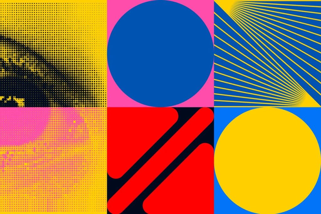
1. Visual Contrast: Enhancing Aesthetics and Readability
Visual contrast is perhaps the most commonly recognized form, crucial in art, design, and everyday visuals.
Key Elements of Visual Contrast:
- Color Contrast: The use of colors that differ significantly on the color wheel (e.g., blue versus orange) creates vibrant, eye-catching designs.
- Light and Dark Contrast: Also known as tonal contrast, this involves the interplay between light and shadow to create depth and highlight key areas in an image or design.
- Texture and Pattern Contrast: Combining smooth and rough textures or different patterns can add visual interest and complexity.
- Size and Shape Contrast: Varying the sizes and shapes of elements within a composition helps create a focal point and hierarchy in design.
Real-World Examples:
- Graphic Design: Advertisements and websites use color contrast to guide the viewer’s attention to call-to-action buttons and key messages.
- Photography: High-contrast black-and-white photography uses the interplay of light and shadow to create dramatic, compelling images.
- Interior Design: Designers use contrast in furniture, wall colors, and decorative elements to create visually stimulating spaces.
Practical Tips:
- Balance is Key: Ensure that the contrast is balanced—too much can overwhelm, while too little may leave a design looking flat.
- Test for Accessibility: High contrast is essential for readability, especially for audiences with visual impairments. Tools like color contrast checkers can help ensure your design is accessible.
2. Conceptual Contrast: Juxtaposing Ideas for Impact
Conceptual contrast involves comparing and contrasting ideas, themes, or concepts to highlight differences and generate insight.
Key Elements of Conceptual Contrast:
- Opposing Ideas: Presenting ideas that are in direct opposition can clarify differences and provoke thought.
- Analogies and Metaphors: These devices often rely on contrasting images or concepts to explain complex ideas in simpler terms.
- Narrative Contrast: In literature and storytelling, contrasting characters, settings, or events can underscore themes and develop plots.
Real-World Examples:
- Literature: In novels, authors use contrast to develop characters. For instance, a benevolent hero might be contrasted with a malevolent antagonist to underscore themes of good versus evil.
- Public Speaking: Politicians and leaders often use contrast to frame debates, highlighting differences between policies or ideologies to persuade audiences.
- Advertising: Marketers use contrast to differentiate their products from competitors, emphasizing unique features and benefits.
Practical Tips:
- Clarity through Contrast: Use contrasting ideas to make your arguments or narratives clearer. Highlight what makes your perspective unique.
- Emotional Engagement: Conceptual contrast can evoke strong emotions. Be mindful of your audience and the message you want to convey.
3. Auditory Contrast: Sound and Silence in Communication
Auditory contrast is the use of varying sound levels, pitches, and rhythms to create emphasis in music, speech, and other auditory mediums.
Key Elements of Auditory Contrast:
- Volume Variation: Changes in loudness can emphasize key points in speech or create dynamic shifts in music.
- Pitch and Tone: Contrasting high and low pitches can add depth and interest to musical compositions.
- Rhythm and Silence: The use of pauses or silence can be as powerful as sound, providing dramatic effect or emphasis.
Real-World Examples:
- Music Production: Composers and producers use contrasts in volume and rhythm to build tension and release in musical pieces.
- Public Speaking: Effective speakers often use silence and changes in tone to underscore important points and maintain audience engagement.
- Film and Theater: Soundtracks and sound effects use auditory contrast to evoke emotions and heighten the storytelling experience.
Practical Tips:
- Pacing: In speeches or presentations, use pauses strategically to let important points sink in.
- Dynamic Range: Ensure that the contrast in your audio is balanced to avoid overwhelming your audience while still maintaining engagement.
4. Contextual and Cultural Contrast: Understanding Differences in Perspective
Contextual and cultural contrast involves comparing different cultural or situational settings to understand how meaning can change.
Key Elements of Contextual and Cultural Contrast:
- Cultural Norms: Different cultures have varying interpretations of what is considered acceptable or appealing, and contrasting these can provide deeper insight.
- Situational Differences: The same message can have different meanings in different contexts. Understanding these nuances is key to effective communication.
- Historical Perspectives: Contrasting historical contexts can shed light on how ideas and practices have evolved over time.
Real-World Examples:
- Cross-Cultural Communication: What might be seen as humorous in one culture could be offensive in another. Marketers and communicators must navigate these differences carefully.
- Historical Analysis: Historians use contrast to compare different time periods, revealing how societal values and norms have shifted.
- Sociology: Researchers compare contrasting social environments to study the effects of context on behavior and attitudes.
Practical Tips:
- Cultural Sensitivity: When working in a global context, always research and understand the cultural contrasts that might affect interpretation.
- Adaptability: Tailor your communication and design strategies to fit the context and cultural background of your target audience.
5. Digital Contrast: Adapting to the Modern Media Landscape
Digital contrast refers to the application of contrast principles in the digital realm, where visual and auditory elements combine with interactive content.
Key Elements of Digital Contrast:
- Interface Design: Digital platforms rely heavily on contrast to create intuitive and engaging user interfaces.
- Multimedia Integration: Effective digital content often integrates text, images, video, and audio with high contrast to capture attention and facilitate comprehension.
- Responsive Design: With the wide variety of devices available, ensuring adequate contrast across all screen sizes and resolutions is crucial.
Real-World Examples:
- Web Design: Websites use contrasting colors and typography to guide users to key information and calls-to-action.
- Mobile Apps: App developers incorporate visual and auditory contrast to enhance usability and user experience.
- Social Media: Digital content creators leverage contrast to stand out in crowded feeds, using bold images and striking layouts to capture attention.
Practical Tips:
- Consistency: Maintain consistent contrast standards across digital platforms to ensure a cohesive user experience.
- Testing: Use digital tools to test contrast ratios and accessibility, ensuring that content is readable and engaging for all users.
Importance, Applications, and Benefits of Understanding Contrast
Understanding what is contrast is not only essential for creative expression but also for effective communication, decision-making, and problem-solving in various fields.
Everyday Life
- Enhanced Communication: Contrast in speech, writing, and visuals improves clarity, making it easier to convey and understand key messages.
- Better Decision-Making: Recognizing differences and weighing options through contrast helps individuals make more informed decisions in daily life.
Business and Marketing
- Brand Differentiation: In competitive markets, effective use of contrast can differentiate brands and products, making them stand out to consumers.
- User Experience: Digital and graphic design that utilizes contrast effectively can enhance user engagement and satisfaction.
- Strategic Messaging: Contrast in advertising helps highlight the unique benefits of a product or service, leading to more persuasive campaigns.
Education and Research
- Critical Analysis: In academic contexts, contrasting different viewpoints or data sets fosters critical thinking and deeper analysis.
- Visual Learning: Educational materials that use contrast effectively can improve retention and comprehension, especially in visual learning environments.
- Interdisciplinary Studies: Contrast is a valuable tool for comparing theories, methodologies, and historical perspectives across disciplines.
Art and Creativity
- Aesthetic Appeal: In art and design, contrast is key to creating visually engaging and dynamic works.
- Emotional Impact: Contrast can evoke strong emotional responses, adding depth and resonance to creative projects.
- Narrative Development: Writers and filmmakers use contrast to develop characters, plotlines, and themes, enhancing the overall storytelling experience.
Addressing Common Misconceptions and FAQs About Contrast
Despite its importance, several misconceptions about what is contrast persist. Let’s clarify these misunderstandings and answer some frequently asked questions.
Common Misconceptions:
Misconception 1: Contrast only applies to visual elements.
Clarification:
While contrast is most noticeable in visual contexts, it also plays a crucial role in auditory, conceptual, and contextual communication.Misconception 2: High contrast is always better.
Clarification:
Effective contrast is about balance. Excessive contrast can overwhelm the audience, while too little can render a design or message bland and unmemorable.Misconception 3: Contrast is solely an aesthetic principle.
Clarification:
Beyond aesthetics, contrast is a powerful tool for communication, persuasion, and problem-solving across various disciplines.
Frequently Asked Questions (FAQs)
Q: How do I determine the right amount of contrast in a design?
A: Consider the purpose of your design and test different contrast ratios. Use digital tools and gather feedback to ensure that your design is both striking and balanced.Q: Can contrast be applied in non-visual contexts?
A: Absolutely. Contrast in tone, style, and ideas can enhance writing, music, and public speaking by emphasizing differences and creating impact.Q: What role does contrast play in effective communication?
A: Contrast helps distinguish key messages from supporting details, making information easier to understand and remember.Q: Are there any tools to help me test contrast in my digital designs?
A: Yes. Tools such as the WebAIM Color Contrast Checker can help you determine if your color choices meet accessibility standards.Q: How does contrast contribute to storytelling?
A: Storytellers use contrast to develop characters, highlight conflicts, and emphasize thematic differences, thereby deepening the narrative.
Modern Relevance and Current Trends in Contrast
The application and understanding of what is contrast are continuously evolving, especially in our digital and globalized world. Here are some current trends and developments:
Digital Media and Interface Design
- Responsive Design: With a multitude of devices and screen sizes, designers must ensure that contrast is maintained consistently to enhance usability and accessibility.
- Interactive Experiences: Modern websites and apps increasingly use dynamic contrast adjustments—such as dark mode and light mode—to provide better user experiences in varying environments.
- Data Visualization: In an era of big data, high-contrast visuals help in creating clear, comprehensible charts and infographics that quickly convey key insights.
Cultural and Global Perspectives
- Cross-Cultural Design: Designers now consider cultural differences in color perception and symbolism, ensuring that contrast is used in ways that resonate with global audiences.
- Inclusive Design: Emphasis on accessibility and inclusive design means that contrast is critical for accommodating users with visual impairments, ensuring that content is legible for everyone.
Innovation in Art and Media
- Hybrid Art Forms: Contemporary artists blend traditional media with digital techniques, using contrast to bridge the gap between old and new art forms.
- Narrative Storytelling: Filmmakers and authors are increasingly leveraging contrast to develop more nuanced and thought-provoking narratives that challenge conventional ideas.
Conclusion: Embracing the Power of Contrast
In our comprehensive exploration of what is contrast, we have discovered that contrast is much more than a mere design principle—it is a fundamental tool that shapes the way we perceive, understand, and communicate information. Whether through visual cues, auditory variations, or conceptual differences, contrast enriches our experiences and adds depth to our interactions.
Key Takeaways:
- Definition: Contrast is the difference between two or more elements that makes them distinguishable, creating emphasis and clarity.
- Applications: It is widely used in art, design, literature, communication, and beyond to highlight differences and enhance meaning.
- Benefits: Understanding and applying contrast can improve aesthetic appeal, boost comprehension, and facilitate more effective communication.
- Modern Trends: With the rise of digital media, inclusive design, and global communication, the principles of contrast are more relevant than ever.
Final Call-to-Action:
Reflect on how you use contrast in your daily life—whether in your creative projects, communication strategies, or decision-making processes. Experiment with different levels of contrast to see how they can transform your work and enhance your message. We encourage you to share your thoughts and experiences in the comments below and to pass this guide along to anyone interested in deepening their understanding of what is contrast.
For further insights, check out reputable resources like Smashing Magazine for design tips and The Interaction Design Foundation for more on digital accessibility and interface design.
Thank you for reading this in-depth guide on what is contrast. Stay curious, experiment boldly, and harness the power of contrast to elevate your creative and communicative endeavors!